Choosing the right wall color can transform the energy of a room. With so many shades and tones out there, it’s easy to feel overwhelmed. I created this post because I want to help you explore how different hues can impact your space, reflecting your personality and setting the mood you desire. Whether you’re revamping your living room, bedroom, or any cozy nook, the right wall color can make all the difference.
If you’re someone who loves home decor, interior design, or just wants to bring a little magic into your space, this guide is for you. You’ll discover 11 wall color ideas that align with various moods and purposes. Each suggestion comes with a sprinkle of color psychology, providing insight into how specific shades can influence feelings and vibes.
Get ready to dive into a world of color where you’ll find options that are calming, invigorating, and everything in between. This guide will arm you with practical ideas that make it simple to transform your home aesthetics. Let’s get started!
Key Takeaways
– Color Psychology: Understand how different wall colors affect your mood and emotions, enhancing your living experience.
– Diverse Palette: Explore 11 unique wall color ideas, from tranquil greens to bold reds, tailored to fit any room and occasion.
– Home Aesthetics: Discover how color choices can change the overall feel of a space, making it more inviting or energizing.
– Practical Tips: Get actionable advice on how to choose the right colors based on the function of each room and your personal style.
– Paint Techniques: Find out about various paint techniques and finishes that can bring your chosen colors to life, adding depth and character to your walls.
Recommended Products

ALL-IN-1 PAINT & PRIMER: A hardy multi-purpose and multi-surface one-coat paint and primer in one for almost any indoor or outdoor surface. A wall, ceiling, floor, skirting...
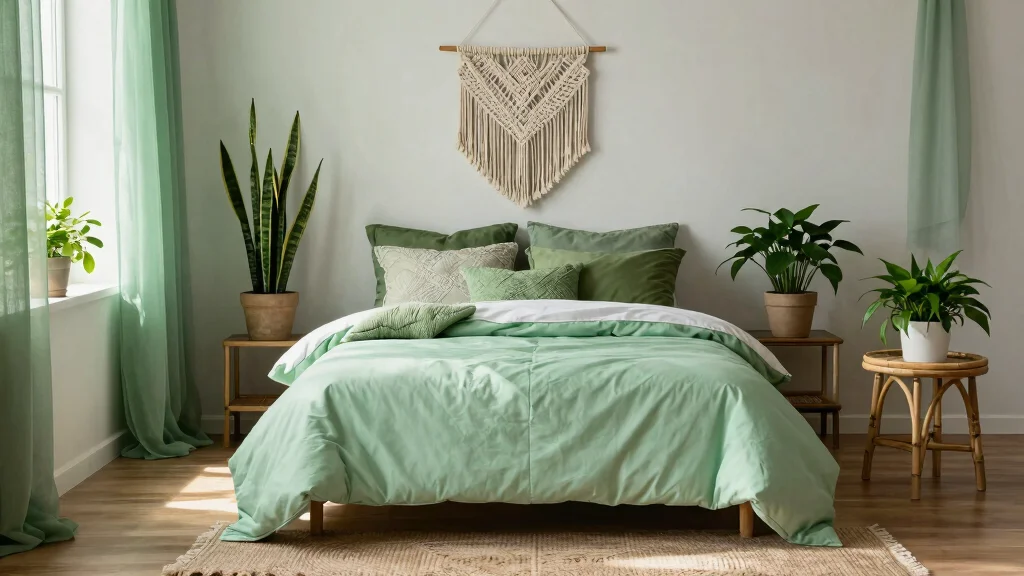
1. Tranquil Greens for Serenity
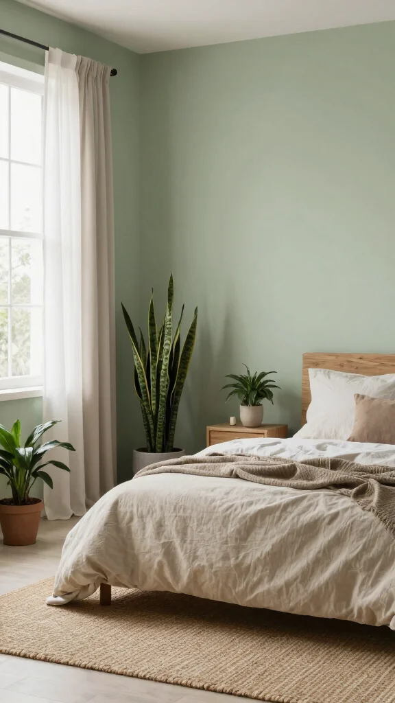
Embracing calming greens in your home can usher in a soothing, serene environment. This color palette evokes the tranquility of nature, inviting a sense of peace and renewal into your space. Consider soft sage green for bedrooms and meditation areas, where it can promote restful relaxation and rejuvenation. Pair it with natural elements like warm wood and gentle textiles for a harmonious feel throughout the room.
To bring this calming palette to life, think about practical ways to implement it. You can find budget-friendly paint options that mimic high-end shades, or even explore fabric swatches that complement your chosen green. This trend aligns with a broader movement toward creating tranquil spaces that enhance emotional well-being.
Tips for Tranquil Greens:
– Pair sage lower cabinets with open oak shelving
– Install butcher block countertops alongside sage islands
– Use walnut handles on green cabinet doors
Incorporating textures like linen and wood amplifies the serene atmosphere, making your home a peaceful retreat.
Recommended Products

COLOR CHANGING – Features 8 vibrant colors to choose from: red, green, blue, pink, orange, purple, yellow and teal – Perfect for your bedroom, bathroom, hallway and more

【Watercolor Nature Wilderness Wall Art】The size of the framed canvas wall art set is: 16x24 inchx3pcs (40x60cmx3pcs) Designed in a modern ink style, this neutral wall art presents a peaceful landscape painting. The misty mountains, the quiet lake and the boat in the distance create an otherworldly mood, adding a sense of peace and harmony to your home or office environment.

Intricate Botanical Design in Neutral Tones: the neutral botanical design of our plant pictures wall art beautifully captures a peaceful and calming environment, along with soft colors and simple patterns, adding a touch of nature right in the heart of your home; The vibrant yet subtle colors are sure to enhance the wall
Key Trade-offs & Our Top Pick
Option 1: Tranquil Greens
– Pros:
– Promotes a sense of calm and relaxation, perfect for bedrooms or meditation spaces.
– Complements natural light well, enhancing any greenery in the room.
– Cons:
– Can make smaller rooms feel cramped if the shade is too dark.
– Might not appeal to everyone’s taste, especially in contemporary designs.
– Best for: Use in spaces meant for unwinding, like bedrooms or study rooms, to help reduce stress levels.
Option 2: Vibrant Mustard
– Pros:
– Adds a cheerful and energetic vibe, great for kitchens or playrooms.
– Works well with a variety of decor styles, from vintage to modern.
– Cons:
– Can be overwhelming if used in large doses; balance is key.
– Fades faster than some darker colors, requiring more frequent touch-ups.
– Best for: Families who want to create lively spaces that stimulate creativity and joy.
Option 3: Deep Blues
– Pros:
– Provides a serene backdrop, enhancing focus and calm in offices or libraries.
– Pairs beautifully with white trim and natural wood accents.
– Cons:
– May make a room feel smaller or darker, especially without adequate lighting.
– Some shades may clash with warmer color palettes.
– Best for: Home offices or reading nooks where concentration and tranquility are prioritized.
Option 4: Soft Neutrals
– Pros:
– Versatile and timeless, fitting seamlessly with any decor style.
– Creates a sense of spaciousness and airiness, making rooms feel larger.
– Cons:
– Can feel bland or uninspired without careful accenting with decor.
– May require additional color pops through furniture or artwork to keep it engaging.
– Best for: Those looking for a blank canvas to easily adapt and refresh decor over time.
Expert Recommendation:
Best Overall: Soft Neutrals
Soft neutrals stand out as the best option for most people. They offer excellent versatility, blending well with various styles and making it easy to switch things up. These colors provide long-term durability and maintain a timeless appeal, making them a cost-effective choice for any room. You can easily add personality through accessories, ensuring a fresh look without a full repaint every few years.
Why We Picked This:
While soft neutrals are ideal for many, those wanting to make a bolder statement might prefer vibrant colors like mustard or deep blues. Tranquil greens are a fantastic choice for relaxation-focused spaces. Choose based on your personal style, room function, and desired atmosphere.
Recommended Products
ALL-IN-1 PAINT & PRIMER: A hardy multi-purpose and multi-surface one-coat paint and primer in one for almost any indoor or outdoor surface. A wall, ceiling, floor, skirting board, cabinet, furniture and door paint for your bathroom, kitchen, home and garden.

Revolutionary spray paint technology that provides exceptional coverage

Ideal for use on interior/exterior surfaces including wood, plastic, plaster, metal, masonry and unglazed ceramic
2. Vibrant Mustard for Energy
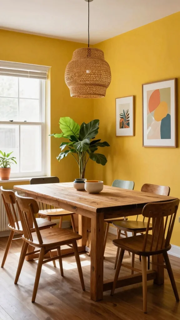
If you seek a color that infuses energy into your home, vibrant mustard yellow is an excellent choice. This lively hue not only brightens a space but also sparks creativity and conversation. Adding a mustard accent wall in a home office or dining area can create a warm, inviting atmosphere that encourages interaction. Combine it with deep blues or soft whites to achieve a balanced, yet dynamic look.
To effectively incorporate mustard, consider using it sparingly as an accent to avoid overwhelming the space. Explore budget options like peel-and-stick wallpaper or paint samples for a fresh pop of color. This trend resonates with a growing desire for lively spaces that inspire joy and connection.
Vibrant Mustard Tips:
– Use it as an accent to avoid overpowering the area
– Combine with earthy tones for a grounded feel
– Ensure good lighting to keep the color vibrant
This color truly shines in naturally lit spaces, making them feel even more energetic and alive.
Recommended Products
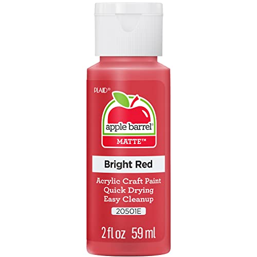
CONVENIENT SIZE - This Apple Barrel Acrylic Paint comes in a versatile 2 oz size that is great for basecoating, stenciling, and so much more

【Trendy Red Leopard Room Decor】This Trendy Leopard Wall Art Set of 3 blends bold cheetah room decor style with funky red and cheetah room decor vibes, creating the perfect accent for a preppy room, apartment, or dorm. Featuring striking cheetah wall decor and leopard print decor details, these prints bring a fashionable statement to any cheetah print bedroom decor or leopard room decor space.
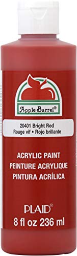
CONVENIENT SIZE - This Apple Barrel Acrylic Paint comes in a versatile 8 oz size that is great for basecoating, stenciling, and so much more
3. Deep Blues for Calm and Focus
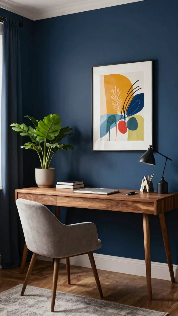
Deep blue shades are perfect for fostering a calm and focused atmosphere. This color promotes relaxation, making it a great choice for offices or libraries. Consider applying navy blue or rich indigo on your walls, creating a stunning backdrop. Pair it with bright white trim for a striking contrast, or introduce wooden accents for a more grounded aesthetic.
To enhance this serene environment, think about warm lighting options that soften the intensity of the blue. You can also curate colorful artwork to break up the bold color and introduce visual interest. This color trend aligns with a growing appreciation for spaces that encourage concentration and tranquility.
Deep Blue Ideas:
– Enhance the mood with warm lighting to soften the blue
– Use colorful art to add interest against the dark background
– Consider textured paint techniques for added depth
In dimly lit settings, these shades create a cozy, intimate feel, ideal for relaxing after a hectic day.
Recommended Products

UNIQUE PEACOCK WALL ART FOR ROOM DECORATION: These Peacock Feather Pictures adding Blue and Green colours to your home décor. Whether you want to put them in your living room, office, kitchen, hallway, or near the TV, they will complement your space with a subtle sense of art and joy.

【Abstract Marble Wall Art Size】- 20 x 40 inch x 1pcs(50 x 100 cm x 4). Abstract teal blue wall art, pink purple and gold marble wall decor. Colorful marble fluid textured prints painting well match in living room office wall decor. Each abstract marble canvas wall decor is stretched on wood frames, ready to hang.
Deep Blues for Calm and Focus
Editor’s Choice

PESRAE Floor Lamp, Remote Control with Stpeless Color Temperatures and B…

EDISHINE Floor Lamp, Remote Control & Foot Switch Floor Lamps for Living…

SUNMORY Arc Floor Lamp,Modern Floor Lamp with 9W 3 Color Temperatures Bu…

Brightech Sky LED Floor lamp, Torchiere Super Bright Floor Lamp for Livi…

Large Framed Colorful Abstract Wall Art for Living Room, Oversized Moder…
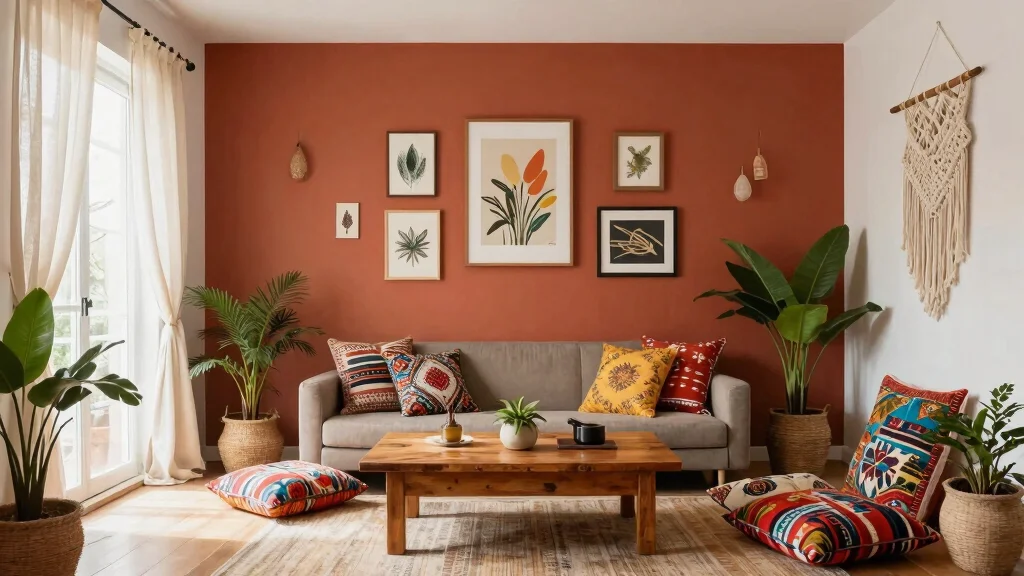
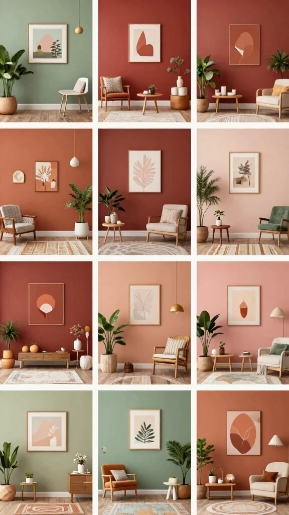
4. Warm Terracotta for Earthy Vibes
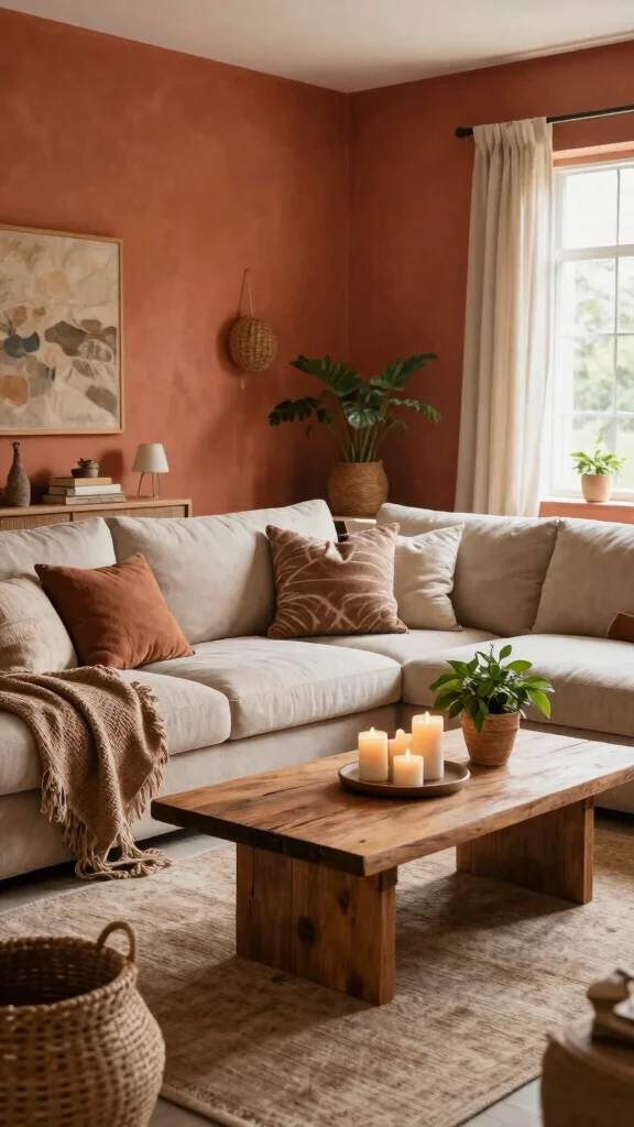
Terracotta embodies earthy warmth, making any space feel inviting and grounded. This rich orange-brown hue is perfect for living rooms and entryways, where comfort is key. Using terracotta on your walls or as an accent can create a cozy focal point that invites relaxation. Pair it with natural wood and textured fabrics to achieve a harmonious, welcoming look.
To maximize this earthy vibe, mix terracotta with natural textures like jute or rattan. You might also explore a stucco finish for added character. This color trend connects with a desire for homes that feel warm and nurturing, especially during the cooler seasons.
Terracotta Tips:
– Mix with natural textures like jute or rattan
– Add a textured wall for visual interest
– Pair with deep greens for vibrant contrast
In well-lit areas, terracotta radiates warmth, making your home feel more inviting and comfortable.
Recommended Products

PAINT + PRIMER IN ONE: Signature formula delivers flawless coverage from the first stroke, sealing surfaces and minimizing coats for a refined finish.

Includes 30 featured and newest released color card. Sprayed on color to see our colors in your homes lighting for more accurate color choices.
PAINT + PRIMER IN ONE: Evolve’s paint-and-primer formula helps you get great coverage from the start, sealing your surface and reducing the extra work of multiple coats.
📹 Related Video: DIY French Country Terracotta Paint Finish
5. Soft Lavender for a Dreamy Touch
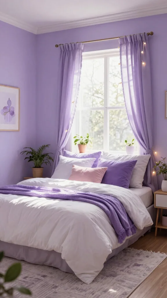
Soft lavender can invigorate any space, merging the calmness of blues with warm reds to create a dreamy, peaceful atmosphere. This soothing color is ideal for bedrooms, nurseries, or inviting reading nooks. Pair lavender walls with white furniture and soft textures to cultivate a light, airy ambiance that feels refreshing.
For a playful touch, consider using patterned wallpaper or incorporating metallic accents like gold for a hint of glam. This color trend enhances the inviting nature of a room, making it perfect for relaxation and comfort.
Lavender Ideas:
– Use patterned wallpaper for playful effects
– Incorporate metallic accents for a glamorous touch
– Combine with pastel colors to enhance softness
In the evening, lavender walls provide a calming backdrop, making it easier to unwind and relax after a long day.
Soft lavender brings a calm glow to any room—perfect among wall color ideas for creating serenity with a touch of warmth. For a soothing, airy space, pair lavender walls with white furniture and soft textures, and add gold accents for a hint of glam.
Recommended Products
【Watercolor Nature Wilderness Wall Art】The size of the framed canvas wall art set is: 24x36 inchx3pcs (60x90cmx3pcs) Designed in a modern ink style, this neutral wall art presents a peaceful landscape painting. The misty mountains, the quiet lake and the boat in the distance create an otherworldly mood, adding a sense of peace and harmony to your home or office environment.

Breathtaking Forest Mountain Design: Experience the beauty of nature with this nature tapestry wall hanging, showcasing misty pine forests, majestic mountains, and soaring birds in soft watercolor tones, adding tranquility and charm to any room

【Track Your Adventures with 500 Pins】 Turn your wall into a visual travel journal with this interactive map of the world. The set includes 500 colorful push pins in 10 distinct colors, allowing you to categorize your adventures—mark where you’ve been, dream destinations, or places you’ve lived
You might also like
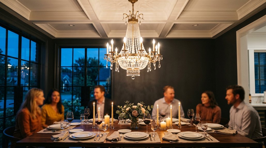
6. Bold Reds for Passion and Energy
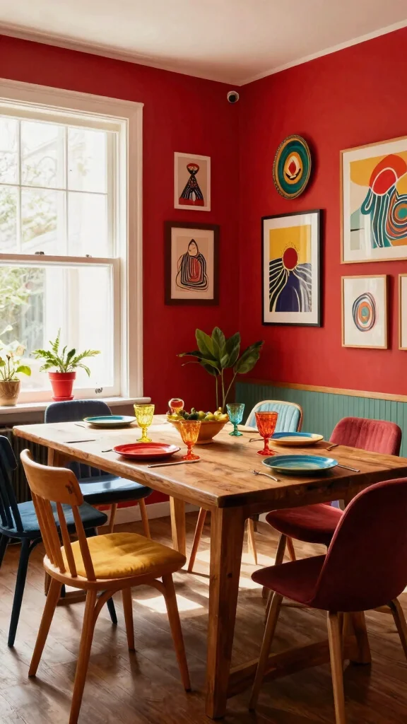
Red is a vibrant, energetic color that evokes passion and excitement. It’s perfect for social spaces like dining rooms and entertainment areas, where it can stimulate lively conversation and enthusiasm. A bright red or deep crimson accent wall can create a dramatic focal point, balanced by neutral tones to prevent overwhelming the room.
To successfully use bold red, pair it with golden accents for a luxurious effect. This color trend aligns with a desire for spaces that inspire social interaction and warmth.
Bold Red Ideas:
– Pair red with golden accents for luxury
– Use it in dining areas to encourage social interaction
– Balance with softer colors in decor to soften impact
This striking color truly comes alive in well-lit spaces, energizing the atmosphere and drawing attention to your decor.
Recommended Products
ALL-IN-1 PAINT & PRIMER: A hardy multi-purpose and multi-surface one-coat paint and primer in one for almost any indoor or outdoor surface. A wall, ceiling, floor, skirting board, cabinet, furniture and door paint for your bathroom, kitchen, home and garden.

Single Acrylic Pigment: Artecho acrylic paint 4.05oz/120ml tube-Sage Green. Individual package is convenient for you to carry around. So You can choose any single pigment as you wish

TRUE ALL-IN-ONE PAINT & PRIMER – Skip the extra steps. Evolve Tru Coat combines paint and primer in one, delivering excellent adhesion and coverage on wood, metal, masonry, and concrete with minimal prep.
Bold Reds for Passion and Energy
Editor’s Choice

THE ONE All-In-One Paint & Primer – Red Satin, 8.5 Fl Oz/250ml Sample | …

Rust-Oleum Farmhouse Red Chalked All-in-One Ultra Matte Paint | One Coat…
THE ONE All-In-One Paint & Primer – Red Matte, 84.5 Fl Oz/2.5 Liter | 1 …

ALL-IN-ONE Paint by Heirloom Traditions, Monarchy (Primary Red), Quart -…
KILZ Tribute Cabinet Paint & Trim Paint, Interior/Exterior, Semigloss, H…
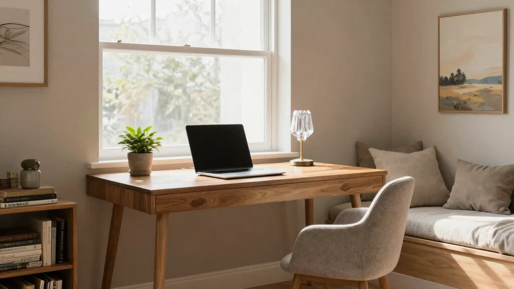
7. Soft Neutrals for Versatility
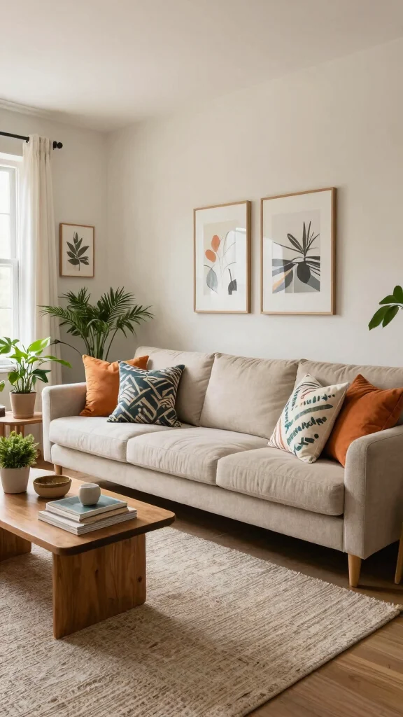
Soft neutrals like beige, cream, and light gray provide calm and versatility in any room. These shades create a perfect backdrop for vibrant decor while maintaining a serene environment. Using a neutral palette allows your accessories and furniture to shine without clashing, offering endless design possibilities.
To enhance this look, mix different neutral shades for added depth and dimension. Consider incorporating colorful artwork or patterned textiles to inject personality into the space. This trend reflects a desire for adaptable environments that suit various styles and preferences.
Neutral Tips:
– Mix different shades for depth and dimension
– Pair with colorful artwork to add personality
– Use creative paint techniques for interest
In the right lighting, neutral walls soften harsh lines, creating a warm, inviting feel that complements any decor style.
Fun fact: Using 3 neutrals—beige, cream, and light gray—in your wall color ideas creates depth and a calmer backdrop that makes bold decor pop. Mix tones in swatches, then add 1 or 2 colorful textiles for personality without clashing.
Recommended Products

Includes 30 featured and newest released color card. Sprayed on color to see our colors in your homes lighting for more accurate color choices.

【It Feels So Good To Be Home Wall Art】This It Feels So Good To Be Home Wall Art is inspired by classic vintage postcards, blending nostalgic charm with modern aesthetics. Perfect as vintage poster wall art, it adds warmth and personality to your home while fitting seamlessly into vintage posters for room aesthetic and vintage art prints collections.
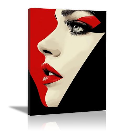
BLACK WOMAN WALL ART: Comes with a sturdy wooden inner frame and pre-installed hanging hardware—no extra tools or assembly needed! Unbox and instantly display this wall art to refresh your space.
Soft Neutrals for Versatility
Editor’s Choice

Furniture Paint Kit 16oz with Tools – Water-based & Low Odor All-in-One …

Country Chic All-in-One Chalk Paint for Furniture, Cabinets, Home Decor,…
Country Chic All-in-One Chalk Paint for Furniture, Cabinets, Home Decor,…
Rust-Oleum Aged Gray Chalked All-in-One Ultra Matte Paint | One Coat Cov…

PRESTIGE Interior Paint and Primer in One, Heather Gray, Semi-Gloss, 1 G…
8. Pastel Colors for Playfulness
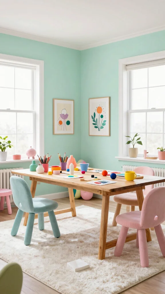
Pastels are not just for nurseries; these playful hues can infuse a soft, cheerful vibe into any space. Think gentle pinks, baby blues, or mint greens for a fun twist on traditional design. Using pastels on your walls is a fantastic way to add character without overwhelming the senses.
These colors work wonderfully in children’s rooms or creative spaces, allowing for bright, cheerful environments. This trend connects with a broader movement toward lighthearted, enjoyable spaces that evoke joy.
Pastel Tips:
– Experiment with contrasting pastel shades for vibrancy
– Combine with white furniture for a fresh look
– Layer in soft fabrics for coziness
Pastels reflect light beautifully, making small spaces feel larger and more inviting, perfect for creating a cheerful atmosphere.
❝ Fun fact: pastel wall color ideas can make a room feel up to 20% brighter. Use gentle pinks, baby blues, or mint greens to add character without overwhelming the senses, great for play spaces and creative corners. ❞
Recommended Products

【Teal Blue Abstract Canvas Wall Art Size】- 12x12 inch x 4pcs(30 x 30 cm x 4). Abstract marble liquid textured lotus wall art, modern elegant flowers wall decor, floral theme prints paintings for your interior home decor, perfect HD prints flowers picture for any room decor.

Tree of Life Wall Art: With lush foliage and deep-rooted foundations, trees symbolize family prosperity, representing faith while offering spiritual comfort. They are available in a variety of colors and styles to cater to diverse aesthetic preferences

Blue Abstract Canvas Wall Art: The modern canvas artwork which is a mixture of cream and blue, it’s very modern. This teal abstract canvas picture has exquisite handmade details, three-dimensional and gorgeous. It can make your space gorgeous and stylish ( Multiple sizes available )
Pastel Colors for Playfulness
Editor’s Choice
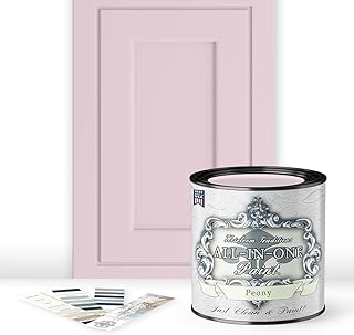
ALL-IN-ONE Paint by Heirloom Traditions, Peony (Pale Pink), Quart – Dura…

EVOLVE Signature Collection Luxury Interior Paint & Primer, Eggshell She…
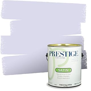
PRESTIGE Paints Interior Paint and Primer in One, 1 Gallon, Satin, Lilac…
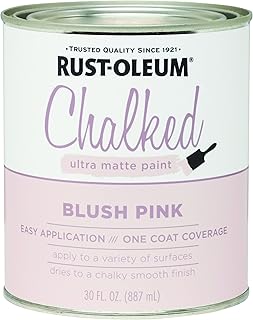
Rust-Oleum Blush Pink Chalked All-in-One Ultra Matte Paint | One Coat Co…

Rust-Oleum Serenity Blue Chalked All-in-One Ultra Matte Paint | One Coat…
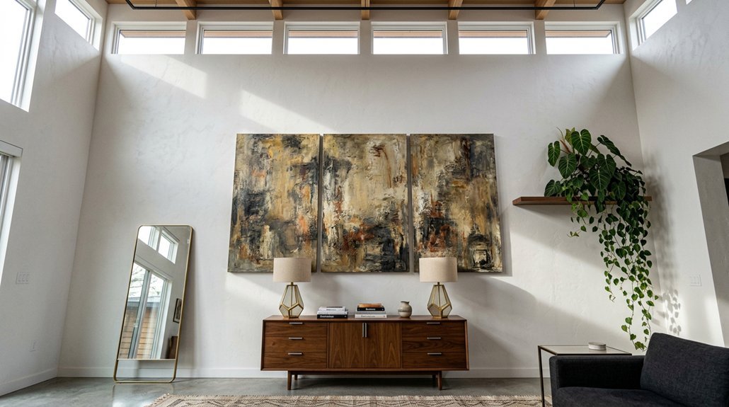
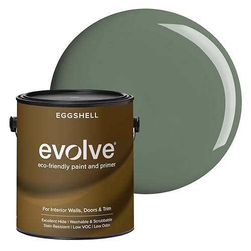
9. Charcoal Gray for Modern Elegance
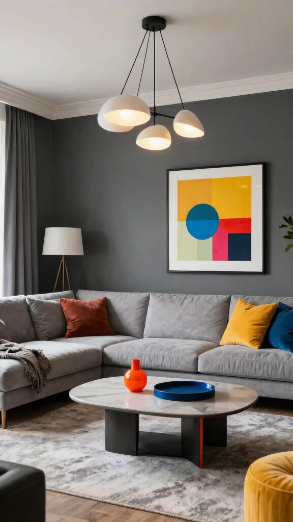
Charcoal gray is the epitome of modern elegance, serving as a sophisticated backdrop for contemporary spaces. This deep hue pairs beautifully with vibrant decor, adding depth and drama to any room. Using charcoal gray on your walls can create a chic, polished look, especially when contrasted with bright whites or metallic accents.
To keep the space lively, incorporate various textures through furnishings and decor. Statement lighting fixtures can draw attention to the elegance of gray, enhancing your overall design. This trend reflects a desire for stylish, modern aesthetics that feel both inviting and sophisticated.
Gray Tips:
– Incorporate textures to prevent dullness
– Use statement lighting to highlight elegance
– Contrast with bold accessories for modern appeal
In low-light settings, charcoal gray transforms into a cozy retreat while maintaining a stylish edge, making it perfect for living rooms or bedrooms.
Charcoal Gray for Modern Elegance
Editor’s Choice

BlissBlush Gray Boho Throw Pillow Cover 20×20 Grey Decorative Accent Pil…

Fancy Homi Set of 4 Grey and White Decorative Throw Pillow Covers 18×18 …

MIULEE Faux Fur Plush Decorative Throw Pillow Covers 18×18 Set of 4, Boh…
Xuyier Knot Pillow Ball, Decorative Throw Pillows with Velvet Fabric for…

6-Light Glass Globe Sputnik Chandelier Modern Matte Black and Gold Ceili…
You Might Also Like
10. Soft Peach for Warmth
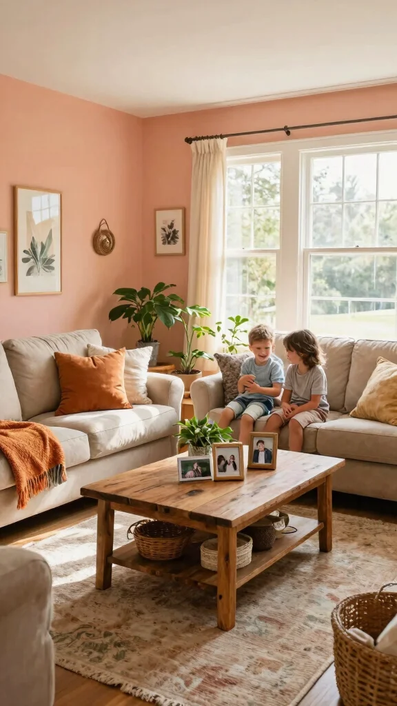
Soft peach is a nurturing hue that promotes warmth and positivity in your home. It creates a cozy environment, ideal for family rooms or gathering spaces. This gentle color works well as a primary or accent hue, pairing beautifully with natural woods for a rustic feel or with whites and grays for a modern twist.
To enhance the warm vibe, mix peach with earthy tones for a balanced, nature-inspired palette. Layering different textures can also amplify the warmth of this color trend, fostering connection and conversation in your space.
Peach Tips:
– Mix with earthy tones for a balanced vibe
– Use in areas to encourage conversation and connection
– Layer textures for added warmth
Peach walls glow warmly in natural light, creating a lively, inviting atmosphere perfect for social gatherings.
11. Jewel Tones for Richness
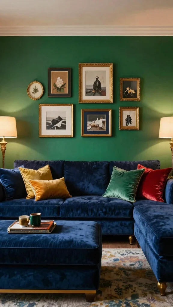
Jewel tones like emerald green, sapphire blue, and amethyst purple exude richness and luxury in any space. These bold colors bring drama and create an inviting atmosphere that captivates the eye. Using jewel tones in your decor can transform your living area into a sophisticated retreat, especially when used on accent walls or through statement furniture pieces.
To enhance the luxurious feel, combine jewel tones with metallic accents for a glamorous touch. This trend resonates with those seeking to create intimate spaces that feel both elegant and cozy.
Jewel Tone Tips:
– Combine with metallic accents for glamour
– Use as accents paired with soft neutrals
– Incorporate textures to enhance luxury
In low-light settings, jewel tones create a cozy, intimate vibe, making them ideal for spaces designed for relaxation and social gatherings.
Conclusion
Choosing the right wall colors can significantly impact the mood and style of your home. From tranquil greens to rich jewel tones, there’s a shade for every personality and purpose.
Explore these eclectic and bohemian wall color ideas, reflecting your unique aesthetic while creating spaces that inspire and invite connection. Remember, your walls are a canvas waiting for the vibrant strokes of your creativity!
Note: We aim to provide accurate product links, but some may occasionally expire or become unavailable. If this happens, please search directly on Amazon for the product or a suitable alternative.
This post contains Amazon affiliate links, meaning we may earn a small commission if you purchase through our links, at no extra cost to you.
Frequently Asked Questions
What wall color ideas help create a cozy, eclectic bohemian vibe in any room?
To create a cozy, eclectic bohemian vibe, start with a warm base color and layer in saturated accents.
Consider wall color ideas that lean earthy tones—terracotta, olive, mustard, and teal—paired with jewel tones like plum or sapphire.
In interior design terms, test swatches in both daylight and lamp light to see how color psychology shifts the mood.
Build home aesthetics by blending textiles, wood, and woven textures. For paint techniques, try a soft color washing or a light rag-roll on an accent wall to add depth without overpowering the room.
Finish with mood lighting—warm bulbs, amber glass, and candles—to complete the vibe.
How can color psychology guide my wall color ideas for different rooms?
Color psychology helps you pick wall color ideas that support the mood you want in each space.
Living rooms often benefit from soft blues or sage greens to invite calm and conversation; bedrooms respond to warm neutrals or blush tones that promote rest.
Kitchens tend to thrive with sunny yellows or crisp whites for energy and clarity.
Test samples on multiple walls and observe under both daylight and mood lighting to see how the colors actually feel in your home.
Pair psychology with practical steps: define your vibe, limit to 2–3 core shades, and use thoughtful paint techniques to create depth.
What paint techniques can elevate mood lighting and texture in bohemian walls?
Get bohemian texture without overwhelming the space by using simple paint techniques.
Try color washing or a soft sponging to create a lived-in, sunlit look that catches mood lighting differently across the wall.
Rag rolling, stippling, or a light balayage trim can add depth while keeping the palette cohesive with interior design goals.
Finish options like matte or eggshell can help colors feel warmer; pair with layered lighting to enhance texture and atmosphere that matches your home aesthetics.
Which color palettes pair well with eclectic decor and bold accents?
For Eclectic Bohemian style, start with a versatile base palette that supports wall color ideas and lets bold accents pop.
Try warm neutrals (cream, taupe) with jewel-tone accents (deep teal, rich terracotta, sapphire) to achieve rich home aesthetics while keeping balance.
Layer textures in textiles and wood to enhance the look, and use paint techniques like a subtle wash on the base wall to create depth without clashing with patterns.
Remember to consider color psychology when pairing cool vs warm hues for each room’s function.
How do I choose wall colors that make a small room look bigger and brighter?
Small rooms benefit from light, airy palettes and careful contrast.
Choose light base colors, white ceilings, and a touch of soft neutrals to reflect more light and expand the space—think wall color ideas that read as airy.
Limit darker shades to one accent wall or a few architectural nooks, and maximize with reflective finishes to boost mood lighting throughout the day.
Test colors with swatches on two adjacent walls and observe under your daytime and artificial lighting to ensure you achieve the desired openness in your home aesthetics.
Related Topics