You’ve probably stood in front of a terracotta swatch wondering what on earth won’t make your room feel like a clay pot exploded. The trick isn’t avoiding warmth—it’s knowing which hues can hold their own against that stubborn, sun-baked edge. Some pairings quiet terracotta down; others crank up the tension in exactly the right way. The real question is what mood you’re after, and the answer might surprise you.
Key Takeaways
- Cream and beige ground terracotta while creating warm, cohesive breathing room.
- Sage green adds natural balance without overpowering terracotta’s earthy warmth.
- Navy blue provides deep contrast and visual rhythm against terracotta’s advancement.
- Dusty pink and rust create tonal depth through shared red-orange DNA harmony.
- Black or charcoal anchors the palette and sharpens terracotta’s earthy character.
Recommended Products

【Perfect Size】Large: 8.3"L × 7.8"H;Medium: 7"L × 6.7"H;Small: 5.3"L × 5.1"H.

Large Decorative Orbs & Balls Bag
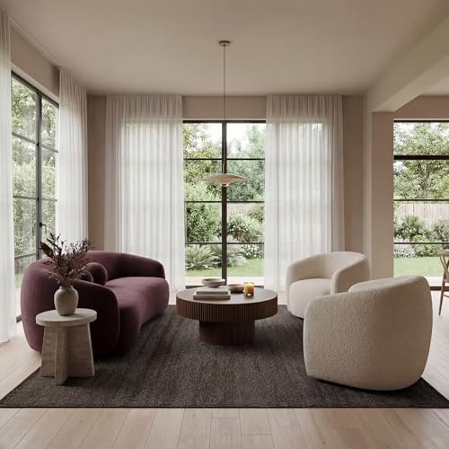
Cream and Beige: The Easiest Terracotta Companions
Why overcomplicate your palette when cream and beige offer the simplest path forward? You ground bold terracotta instantly with these warm neutrals. You paint your walls in buttermilk or sand, then let terracotta accents—throw pillows, ceramic vases, area rugs—pop without clashing. You create breathing room; the eye travels easily across your space. You layer textures like linen, raw cotton, and unfinished wood to keep things interesting. You notice how beige tempers terracotta’s intensity while cream brightens darker corners. You avoid competing for attention; these pairings whisper rather than shout. You pull from desert landscapes and sunbaked architecture without trying too hard. You achieve timelessness effortlessly. You make mistakes nearly impossible with this duo. You relax knowing your home feels cohesive, warm, and intentionally calm.
Recommended Products

【Provence Rug】This rug features a traditional block print motif with a central floral medallion and delicate botanical details within a classic inset border. Rendered in a soft, earthy color palette of muted blues, creams, and terracotta, it embodies the rustic charm and relaxed elegance of the French countryside. Perfect for adding a touch of artisanal, vintage character to farmhouse, boho, or traditional interiors.

The Malibu Collection is an indoor/outdoor area rug featuring geometric patterns in airy, neutral palettes, with playfully fringed edges; from renowned interior designer Amber Lewis in collaboration with Loloi

Machine Washable Rugs Easy to Clean: the surface is water-repellent which allows for easy cleanup when beverages are accidentally spilled, as the liquid is less likely to seep in. Simply use a towel to promptly wipe away any spills. For localized stains, you can use a cleaning agent and a damp cloth for spot cleaning, or utilize a vacuum cleaner for overall maintenance. You can also put the rug in a washing machine as it is a machine washable rug.
Sage Green: Natural Balance for Terracotta Interiors
Cream and beige settle your space, but you crave something alive. You reach for sage green, and suddenly your terracotta walls breathe. This pairing mirrors nature itself—dry clay against living foliage, sunbaked earth beneath whispering leaves.
You layer sage velvet against terracotta plaster, or hang dusty green linen curtains beside rust-toned pottery. The coolness tames terracotta’s heat without extinguishing it; the warmth keeps sage from feeling flat or clinical. You’re building tension, yes, but the gentle kind that holds attention.
Try weathered sage cabinetry in a terracotta kitchen, or trailing eucalyptus above a rust-colored sofa. You don’t need loud patterns or metallic accents here. The colors do their own quiet work. You step back, and the room feels found, not decorated—rooted, balanced, complete.
Recommended Products

BOHO BOTANICAL GEOMETRIC ART SET:This boho botanical geometric framed canvas wall art set features abstract plant figure designs in soft sage green and warm terracotta tones,blending delicate leaf silhouettes with geometric shapes to create a calm,modern minimalist aesthetic.

ALL-IN-1 PAINT & PRIMER: A hardy multi-purpose and multi-surface one-coat paint and primer in one for almost any indoor or outdoor surface. A wall, ceiling, floor, skirting board, cabinet, furniture and door paint for your bathroom, kitchen, home and garden.
ALL-IN-1 PAINT & PRIMER: A hardy multi-purpose and multi-surface one-coat paint and primer in one for almost any indoor or outdoor surface. A wall, ceiling, floor, skirting board, cabinet, furniture and door paint for your bathroom, kitchen, home and garden.
Navy Blue: Deep Contrast Without the Drama
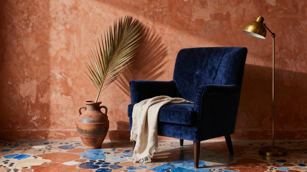
Where else can you find such depth without darkness swallowing the room? Navy blue gives you exactly that—a bold anchor that lets terracotta glow without competing for attention.
You’ll notice how this pairing works immediately. The cool undertones of navy recede while warm terracotta advances, creating natural visual rhythm. You’re not fighting; you’re collaborating. In your living room, try navy velvet against terracotta walls.
Your bedroom benefits from reversed roles—terracotta bedding on navy painted trim. You’re building sophistication without stuffiness.
Don’t overthink the ratio. You’re aiming for roughly sixty percent navy, forty percent terracotta to keep energy balanced. Add brass fixtures and you’re finished; their warmth bridges both colors effortlessly. You’ve created contrast that feels intentional, not jarring. Navy doesn’t shout against terracotta—it supports, elevates, and completes your space with quiet confidence.
Recommended Products

【HIGH QUALITY MATERIAL】2 PC Imported boho throw pillow cover(Not Contains Insert). Made of durable polyester linen material. Spring summer Throw Pillow Case is comfortable to touch and lay on.Not deformed and Not fade.
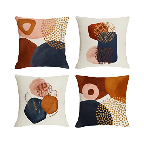
Boho Chic: Bring the warm hues into your home with our abstract pillow covers. Printed with a contemporary arrangement of blue brush pink pastel, gold, terracotta, oranges, rust colored, neutrals and clay colored decorative throw pillows are the perfect accent piece to style and instantly brighten any corner Package Includes: 4 pcs graffiti art modern decorative pillow covers featuring abstract shapes and line with wa

【Size】: 18x18 inch (45x45cm). Package Content: Set of 2 pillow covers(Not include Insert or filler).
Dusty Pink and Rust: Building a Tonal Terracotta Palette
How do you deepen terracotta’s warmth without drifting into monochrome boredom? You layer it. Dusty pink and rust create a tonal palette that feels intentional, not repetitive.
You start with your base terracotta, then introduce dusty pink through upholstery, textiles, or painted furniture. The muted rose undertones speak directly to terracotta’s clay origins without competing for attention.
Add rust as your accent—deeper, more oxidized, more dramatic. Use it in leather ottomans, vintage ceramics, or iron light fixtures.
You’re building a single chord, not a clash. These colors share the same red-orange DNA, so you’ve got automatic harmony. You vary the saturation and value instead. Light dusty pink recedes; saturated rust advances. Your eye travels naturally across the room, finding interest in subtle shifts rather than stark contrasts.
Recommended Products

A warm beige and cream base dominates the field, with softly faded gray scrollwork and floral motifs layered throughout — accented by subtle touches of dusty blue and muted mustard that add depth without disrupting the rug's calm, neutral harmony.
Natural Materials: Our area rug is handmade from 60% Jute, 40% Cotton and expertly made in India with quality craftsmanship. Due to the handmade nature of this rug, there may be slight variations in color and size making this rug unique to your home.

Effortless Care for Spacious Living Areas: Designed for large living rooms, bedrooms, and open spaces, this 9'x12' washable area rug easily handles daily foot traffic, spills, and pet mess. Simply vacuum for routine upkeep or machine wash cold for deeper cleaning. Crafted to retain its warm terracotta earth tone and soft texture over time, it keeps your home looking welcoming and refined
Black and Charcoal: Grounding Warm Terracotta Walls
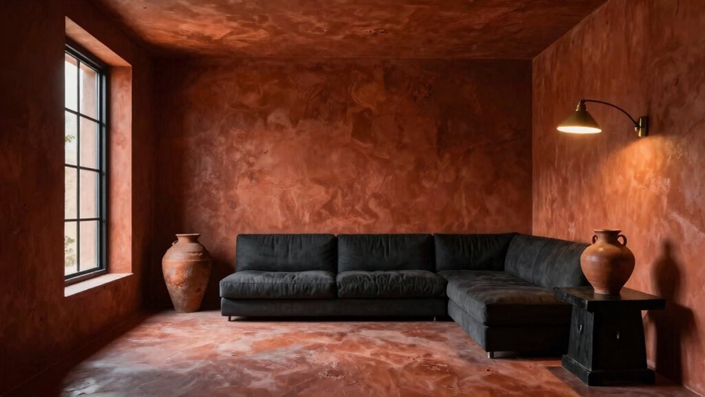
Tonal palettes soften a room, but sometimes you need weight at the foundation. You anchor terracotta walls with black or charcoal to stop the warmth from floating away. You paint trim, doors, or a single accent wall in deep charcoal, and suddenly the clay tones feel intentional, not accidental.
You choose matte black for hardware, lighting, or window frames to carve sharp definition against the porous orange. You layer charcoal textiles—heavy linen curtains, woven throws—to absorb excess light and add gravity.
You avoid competing warmth; you let the cool depth of black create tension that terracotta alone can’t achieve. You step back and see the balance: earth and shadow, heat and restraint. You’ve grounded the space without dimming its character.
Recommended Products

𝑨𝒓𝒆 𝒚𝒐𝒖 𝒇𝒊𝒏𝒅𝒊𝒏𝒈 𝒂 𝒈𝒊𝒇𝒕 𝒇𝒐𝒓 𝒉𝒊𝒎 𝒐𝒓 𝒉𝒆𝒓? 𝑻𝒉𝒊𝒔 𝑭𝒂𝒓𝒎𝒉𝒐𝒖𝒔𝒆 𝑪𝒆𝒓𝒂𝒎𝒊𝒄 𝑹𝒖𝒔𝒕𝒊𝒄 𝑽𝒂𝒔𝒆 𝑭𝒐𝒓 𝑯𝒐𝒎𝒆 𝑫𝒆𝒄𝒐𝒓 𝒘𝒊𝒍𝒍 𝒃𝒆 𝒂 𝒈𝒓𝒆𝒂𝒕 𝒄𝒉𝒐𝒊𝒄𝒆. 𝑾𝒊𝒔𝒉 𝒚𝒐𝒖 𝒉𝒂𝒗𝒆 𝒂 𝒏𝒊𝒄𝒆 𝒅𝒂𝒚!

Material: High quality silk and foam flowers and greenery, and some embellishing accessories.

High quality and durable: Socomi table runners are made of premium cotton.
Layered Terracotta: How to Use One Color Multiple Ways
Why limit yourself to one shade when the color itself offers so much range? You’ll discover terracotta spans from pale clay to deep rust, and layering these variations creates depth without introducing competing colors.
Start with your walls in a mid-tone terracotta. Then introduce lighter versions through linen upholstery, ceramic vases, or woven baskets. You’ll anchor the space with darker terracotta accents—perhaps leather ottomans or matte pottery. This tonal approach builds visual interest through texture and saturation shifts rather than hue contrast.
You’ll want to vary finishes too. Pair matte plaster walls with glazed ceramics and nubby terracotta textiles. The interplay of sheen prevents monotony while maintaining cohesion. You’re essentially creating a gradient that guides the eye through your space, proving one color family delivers complete sophistication when deployed strategically.
Recommended Products

Neutral Vintage Design: This WondRg area rug has a trendy retro style and unique floral pattern, unique tones blend perfectly with your home great way to show your personal style and enhance the beauty of any room in your home

FOLIAGE OF TRADITION: Featuring a foliage-inspired bordered pattern of rustic red and brown hues, anyone can satisfy their style and décor preferences with this collection, while instantly capturing the vibrant colors and warm feelings of harvest time.

Elegant Jacquard Design: Boasting elegant tufted details, this high-low textured rug creates a sculptural 3D surface that adds layered visual depth and a luxuriously tactile underfoot feel. It seamlessly blends artistic aesthetics with everyday practicality, lending a stylish, warm and inviting ambiance to modern home interiors.
Choosing Your Terracotta Pairing by Room and Light
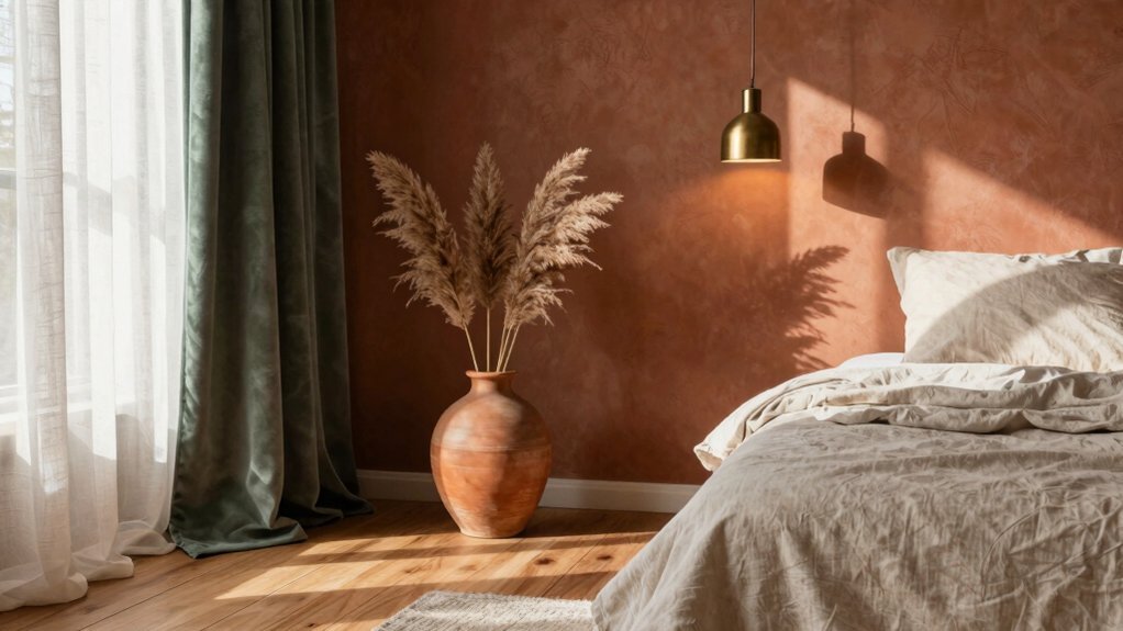
Where you place terracotta matters as much as the shade you pick, since natural light transforms the color throughout the day. In south-facing rooms, terracotta glows warm and vibrant, so you can pair it with cooler tones like sage or soft blue to balance the intensity.
North-facing spaces drain warmth from terracotta, making it appear dull and brown; here you’ll want to boost it with cream, coral, or amber accents that restore the missing heat.
East-facing rooms catch morning sun, where terracotta pairs beautifully with charcoal and blush for a fresh start.
West-facing rooms bathe in golden afternoon light, so terracotta deepens dramatically alongside olive or rust.
Test your pairings at different hours before committing, and you’ll avoid surprises when the sun shifts.
Recommended Products

CHDITB Neutral Botanical Framed Canvas Wall Art, Boho Minimalist Leaf Wall Decor, Abstract Geometric Nature Plant Wall Painting, Sage Green Terracotta Art Prints for Bedroom Living Room 12”X16”X3
Conclusion
You don’t need to overthink terracotta pairings. Match it with cream for softness, sage for harmony, or navy for punch. Build depth with dusty pink and rust, or ground everything with charcoal. Light changes terracotta throughout the day, so test swatches in your actual space. Trust your eye—you’ll know when it feels right.