You’ve probably wondered why some small rooms feel airy while others feel like a cave. The secret isn’t square footage—it’s how color manipulates light and perception. You’ll soon discover which shades actually expand your space and which ones quietly shrink it.
Key Takeaways
- Light colors reflect more light, bouncing it around the room to dissolve boundaries and expand space visually.
- Cool whites with blue or gray undertones push walls outward, creating a receding effect that enlarges the room.
- Soft blues and greens blur the wall-air boundary, making walls appear to retreat without feeling sterile or cold.
- Warm neutrals like creamy beiges and toasted taupes reflect light and add coziness without exposing harsh shadows.
- Ceilings painted lighter than walls, in white, cream, or pale blue, create the illusion of greater height and openness.
The Best Paint Colors for Small Rooms (And How to Choose)
Where do you even start when every paint chip seems wrong? You grab the samples that catch your eye, then you test them on your walls. You watch how they shift from morning light to evening shadow.
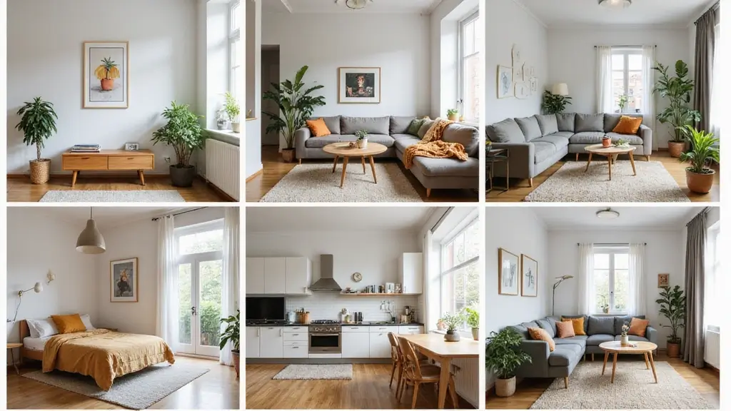
You lean toward soft whites, pale grays, and muted blues because they reflect light rather than absorb it. You avoid harsh pure whites; they’ll feel sterile and flat. You consider warm off-whites with subtle undertones that complement your flooring and furniture.
You narrow your choices to three favorites. You paint generous swatches, living with each for a full day. You notice which one feels calming, which expands your walls visually. You trust this process. You select the shade that makes your space breathe. You buy your paint and begin.
How Paint Colors Trick Your Brain Into Seeing More Space
You’ve chosen your color and started painting. Now watch your walls work magic. Light colors reflect more light, bouncing it around your room and dissolving boundaries. Your brain interprets this brightness as openness, expanding perceived space beyond physical limits.
Dark colors aren’t excluded; they blur edges too. Deep tones absorb shadows, making corners disappear and walls recede. When you paint ceilings slightly lighter than walls, you create height illusions.
Cool colors—blues, greens, soft grays—trick your perception of depth. They appear to retreat, pushing walls outward visually. Warm colors advance, but pale versions prevent enclosure.
Color temperature matters. Matching trim to walls eliminates visual breaks, creating seamless expanses. Your eye travels uninterrupted, processing one continuous surface rather than chopped segments.
Contrast shrinks space; subtlety expands it.
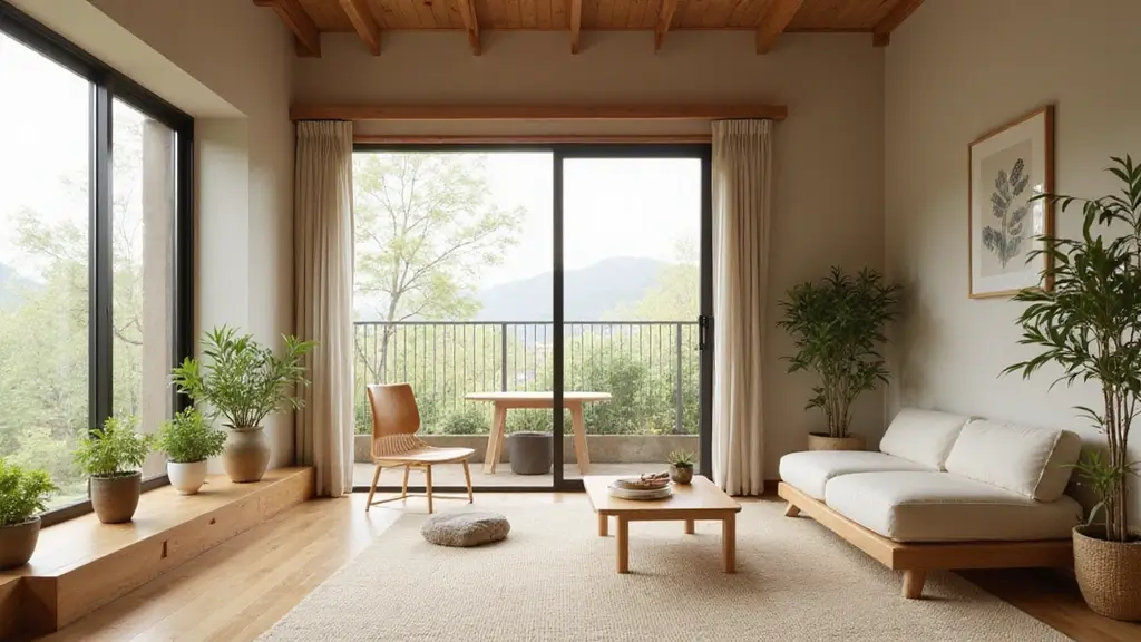
White and Off-White Paint Shades That Maximize Space
How do you pick the right white when dozens of swatches blur together? You start by understanding undertones. Whites with cool blue or gray undertones recede visually, pushing walls outward. You select warm whites—those with yellow or cream bases—only when your room lacks natural light, as they’ll keep the space from feeling sterile.
You test samples on multiple walls at different times of day. You watch how morning sun versus artificial evening light transforms each shade. Stark white can feel clinical, so you lean toward soft off-whites with names like “alabaster” or “eggshell.”
You extend your chosen shade onto trim and ceiling, eliminating visual breaks that chop up your perception of space. You let one continuous color blur boundaries. You create breathing room.
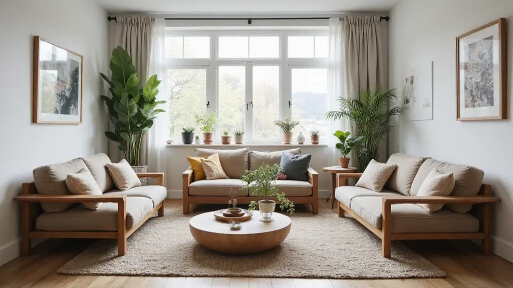
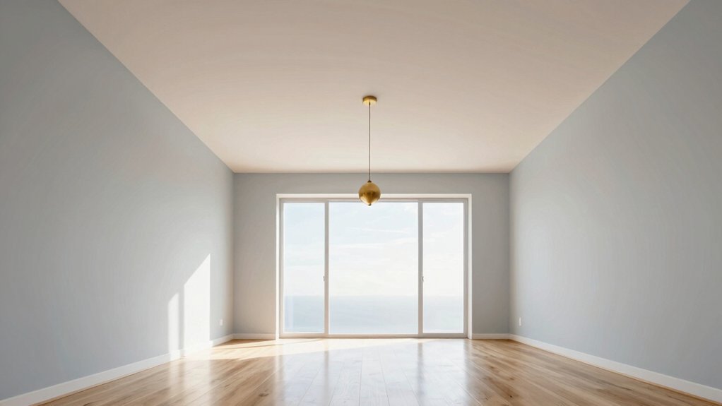
Soft Blue and Green Paint Colors That Push Walls Back
Why settle for white when soft blues and greens can stretch your walls even further? These hues recede visually, creating depth where tight quarters feel confining.
You’ll notice soft blues—think misty aqua, sea glass, or pale sky—blur boundaries between wall and air. They borrow tricks from nature: look at the horizon, and you’ll see distance painted in blue. Your small room works the same way.
Sage, mint, and celadon greens perform similarly. They push walls backward without the sterility of pure white. You choose sophistication over safety.
Apply these colors in matte or eggshell finishes. Gloss reflects too aggressively; you want subtle absorption. Test samples at different times of day. You’ll watch shadows soften and corners dissolve.
Combine with minimal contrast trim. You keep the eye moving uninterrupted, and suddenly you’ve gained square footage you never had.
Recommended Products

Ready-mixed, grab-n-go white ceiling paint
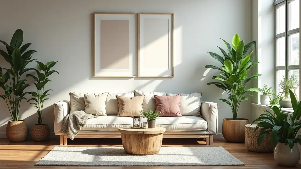
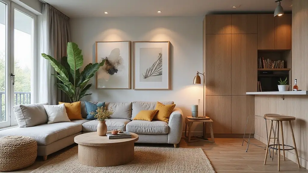
Warm Neutral Paint Colors for Small Rooms
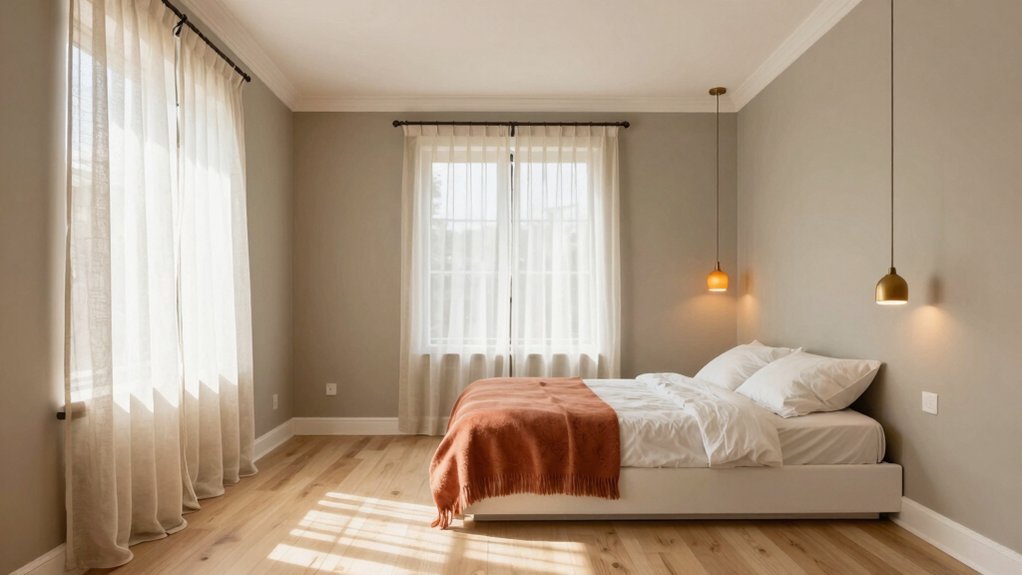
Warmth doesn’t demand space—it creates it. You push walls outward when you choose creamy beiges, toasted taupes, or soft warm greiges. These hues catch and reflect light, turning cramped corners into inviting nooks.
You avoid stark whites that expose every shadow. Instead, you layer warmth through paint with subtle yellow or pink undertones. Pair these walls with natural wood tones and you’ll see the room expand visually.
You test samples at different times of day since warm neutrals shift dramatically. Morning sun amplifies their glow; evening absorbs excess. Pick a shade one step lighter than your instinct suggests.
You create cohesion by extending your chosen neutral onto trim and ceilings. This erases visual boundaries. Your small room breathes.
Recommended Products
Ideal for use on interior/exterior surfaces including wood, plastic, plaster, metal, masonry and unglazed ceramic
How to Paint Dark Colors Without Shrinking Your Space
Where does depth end and confinement begin? You navigate this boundary when you paint small spaces with dark hues. You ground your walls with charcoal, navy, or forest green, but you don’t stop there. You strike vital deals with light: you install mirrors opposite windows, you choose glossy finishes that reflect what brightness you’ve got, and you keep trim crisp and white so boundaries breathe.
You limit dark paint to a single accent wall—preferably the farthest one—creating an illusion of receding space. You furnish minimally, letting negative space work as hard as your palette. You select low-profile pieces that don’t crowd sightlines. You remember that shadow needs breathing room. When you handle darkness deliberately, you don’t shrink your space; you gift it dimension, mystery, and surprising spaciousness.
Ceiling Paint Colors That Visually Raise the Roof
Dark walls might stretch your space horizontally, but you’ve still got another dimension to play with. Your ceiling holds untapped potential for vertical expansion, and you’ll exploit it with strategic color choices.
Paint your ceiling pure white or soft cream and you’ll push it upward instantly. These reflective shades bounce light downward, creating airy height where cramped quarters once loomed. You’ll gain inches visually without touching a beam.
For dramatic effect, try pale blue or barely-there gray. You’ll evoke open sky overhead, tricking your eye into perceiving unlimited vertical space. Gloss finishes amplify this effect as they catch and scatter illumination across the surface.
Avoid dark ceiling colors unless you’re angling for cozy intimacy. You’ll compress your room downward, undoing every spatial gain you’ve achieved. Stick light, stay bright, and you’ll breathe easier beneath your newly elevated roof.
Trim Paint Colors That Stretch Every Inch
Why stop at walls and ceilings when your trim frames the entire space? Paint your baseboards, door frames, and molding in crisp white to create seamless borders that push walls outward. Match your trim to your wall color for a continuous, unbroken sweep that dissolves boundaries and expands perceived square footage. You’ll stretch vertical space by carrying that same shade up to crown molding. Don’t forget—glossy finishes reflect light better than flat paint, so choose satin or semi-gloss sheens to amplify brightness. If white feels too stark, try soft cream or pale gray on trim; you’ll still achieve visual expansion without sacrificing warmth. Dark trim works against you, chopping rooms into smaller pieces. Keep it light, keep it cohesive, and watch your cramped quarters breathe.
Conclusion
You can make any small room feel larger with smart color choices. Stick to cool whites, soft blues, and pale greens to push walls outward. Keep ceilings light and consider matching trim to walls for seamless boundaries. If you crave depth, paint one dark accent wall farthest from the door without fear. Remember: matte finishes reduce glare, and cohesion always wins. Trust your instincts, test samples first, and watch your space instantly expand.