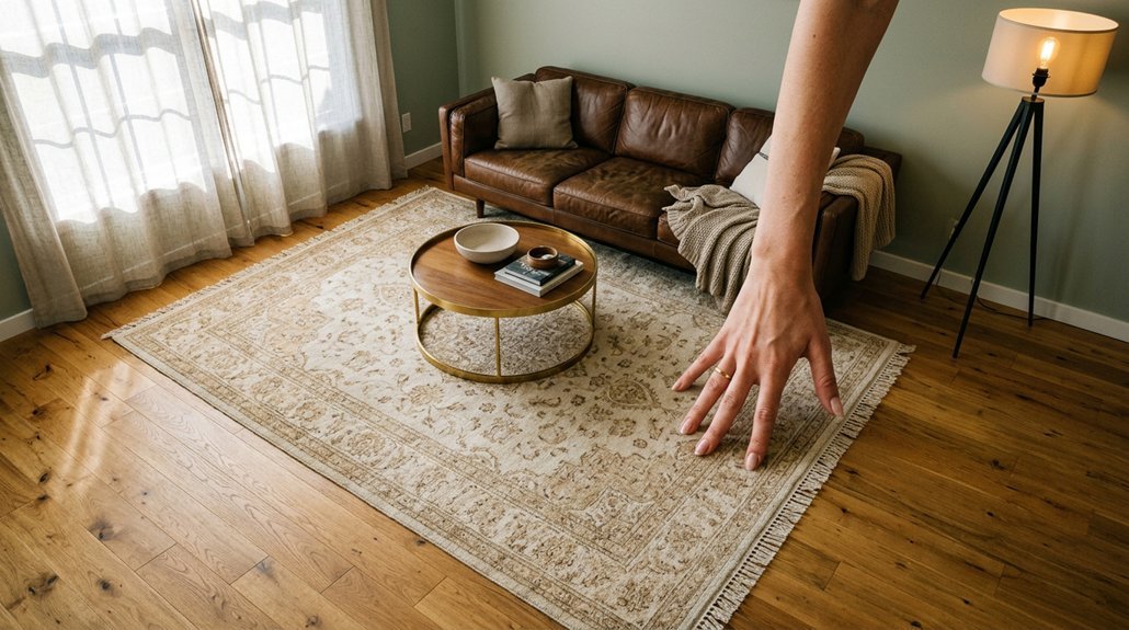
You stand in your space, surrounded by swatches and indecision, knowing the rug will either ground everything or unravel it. The right color isn’t about matching—it’s about intention. Whether you need warmth, quiet, or a moment of boldness, your choice shapes what the room becomes. And the method is simpler than you’ve been told.
What Your Room Actually Needs: Anchor, Blend, or Contrast
Where do you begin when every swatch seems equally compelling? You start by diagnosing your room needs with clear intention.
Anchoring demands grounding neutrals that unify architectural features and décor without overwhelming the eye. You achieve this through tone-on-tone backdrops that establish calm, cohesive palettes throughout your space.
Blending calls for harmonious colors in similar or complementary hues, allowing furniture and architectural details to command attention while the rug recedes gracefully.
Contrast requires bolder, deeper tones that carve visual separation and establish a commanding focal point, particularly effective in expansive rooms with warm floors and abundant light.
You build each approach methodically: begin with a base neutral, then introduce one or two accent colors to sharpen your intent. The result transcends mere decoration—you craft environments that breathe with purpose and precision.
Recommended Products

Neutral Vintage Style: This PureCozy area rug features a modern vintage look with an elegant floral pattern. The softly muted tones blend effortlessly with different home styles, helping express your personal taste while elevating the overall décor of any room.

The Malibu Collection is an indoor/outdoor area rug featuring geometric patterns in airy, neutral palettes, with playfully fringed edges; from renowned interior designer Amber Lewis in collaboration with Loloi

Neutral Vintage Style: This PureCozy area rug features a modern vintage look with an elegant floral pattern. The softly muted tones blend effortlessly with different home styles, helping express your personal taste while elevating the overall décor of any room.
Room-by-Room Rug Color Rules (Living, Bedroom, Dining)
How do you translate a room’s purpose into color without losing coherence? You begin by defining the rug’s role in each space.
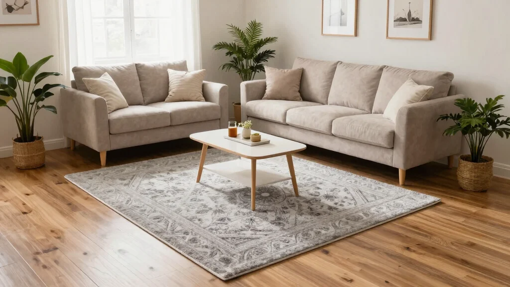
In the living room, you anchor furniture using warm grays for modern minimalism or navy and forest green for traditional settings. You balance two main palette colors, letting architectural features breathe while the rug unifies.
For the bedroom, you choose a neutral rug—white or subtle tones—for serenity, or warm, deep hues for enveloping comfort. You remember that white demands restraint in high-traffic areas, whereas darker tones conceal wear gracefully.
In the dining room, you select understated hues that frame dark wood without competing. Round rugs complement tables beautifully here.
You always test color under natural light and evening illumination, ensuring your choice defines rather than overwhelms each distinct space.
Recommended Products

VINTAGE BOHO AREA RUG: With its plush high-low piles, this 5x7 area rugs delivers an incredibly comfortable and soft sensation, making it suitable for going barefoot. Lay the carpet over your hardwood floor, and it not only infuses warmth but also turns any room into a snuggle-worthy retreat

LARGE SIZE: This unique 8' x 10' area rug is ideal for larger rooms like bedrooms, living rooms, and kitchens. Other sizes are available to fit any space in your home.

Traditional & Vintage: Our area rug 5 x7 is designed with a vintage, faded, traditional, Medallion, classic, shabby chic styles. Beautiful stylish Moroccan pattern and has a mystical quality that feels right out of a fairy tale, its purposefully faded look is perfect for adding vintage appeal to your space.
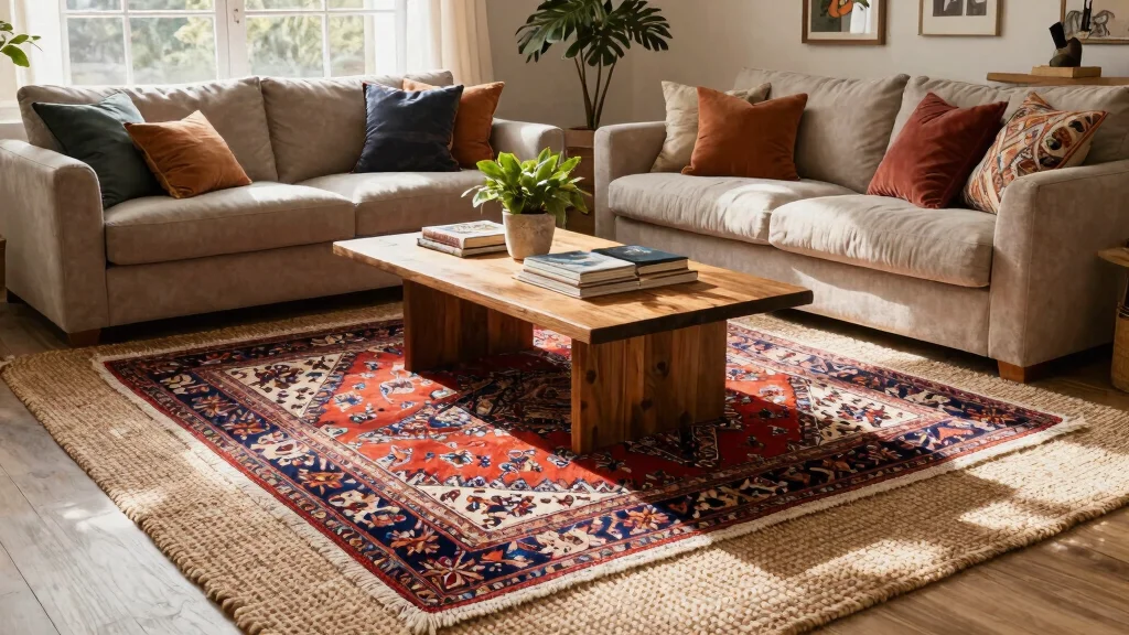
One Neutral Base Plus One or Two Accent Colors
Why settle for flat, monotonous floors when a single neutral foundation can carry so much more? Start with a neutral base—warm beige, sophisticated gray, or luminous ivory—to establish versatility across your space. Then introduce one or two accent colors through your rug color selection, creating contrast and depth without overwhelming the room.
You’ll find balance by threading these accent colors through controlled doses: perhaps a patterned rug picking up tones from your upholstery, or a solid tone echoing artwork across the space. Harmony emerges when you let the rug color anchor rather than mirror every element. Maintain equilibrium through intentional contrast—lighter ivories against dark furnishings, deeper accents defining zones atop pale floors. Patterns offer another pathway, weaving complexity while preserving cohesion.
Recommended Products

High-Quality Faux Fur: Features a luxurious shaggy surface (1.53-inch high pile), a shock-absorbent sponge mid-layer for cushioning support, and durable non-woven fabric backing. This rug is 30% thicker than competitors' options, with no fiber shedding issues

Super Soft Fluffy Rug: The surface of Lairep's 5x7 shaggy rug is made of high-density, premium velvet material, making the fuzzy rug ultra soft and skin-friendly, warm and luxurious. Meanwhile, the plush area rug is lasting and will not shed, fade or odor. The center layer is a thickened shock-absorbing sponge that provides cushioning support and increases the thickness of the deep green carpet, creating a comfortable area for your family

Serene Forest Design: Transform any room with a lush green forest rugs, featuring rich botanical details and calming vintage accents. This 5x7 washable area rug elegant design brings the tranquility of the forest into your living room, bedroom, or kitchen
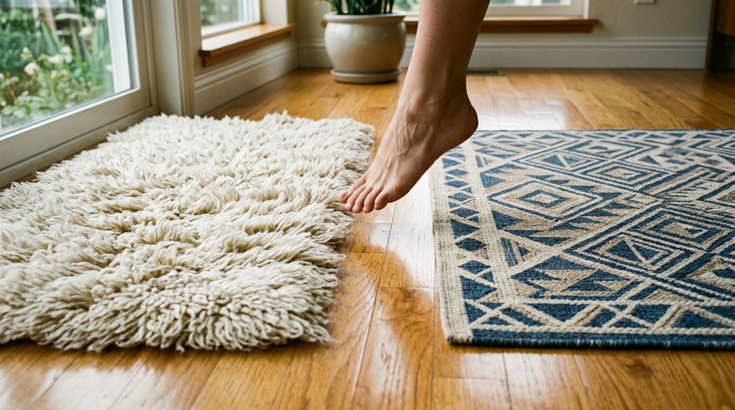
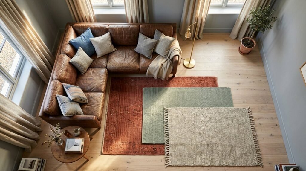
Floor Contrast: Match Without Mimicking
Your rug shouldn’t disappear into the floor beneath it. Establishing deliberate rug color contrast creates essential visual separation, transforming your floor from backdrop to intentional design layer. When considering rug vs floor dynamics, you’ll want to avoid mimicking floor tones too precisely—instead, embrace a contrasting rug that commands attention.
If you’re working with warm floors, cool rug selections with complementary color undertones generate sophisticated tension. This warm floors cool rug approach prevents muddled, indistinct boundaries. Even when palette similarity feels unavoidable, deploy texture and pattern to maintain distinct floor contrast—a nubby weave or geometric motif rescues tonal proximity from visual collapse.
In compact rooms, amplify small space contrast; sharper distinctions between surfaces expand perceived dimensions and anchor furnishings with authority. Let your rug float deliberately above its foundation.
Recommended Products

Vintage Botanical Elegance: Echoing the refined artistry of 19th-century textile traditions, this floor rug showcases a classic botanical design that elevates any space. A rich palette of black, deep emerald, and moss tones flows through intricate floral and oriental motifs, creating a dramatic focal point. Inspired by Victorian aesthetics, the contrast of vivid greens, vibrant reds, and delicate vines adds depth and sophistication, infusing your home with timeless vintage charm

Designed to withstand everyday wear, this 5 Ft Round area rug is the perfect size for living rooms, dining rooms, or anywhere you want to add a touch of vintage elegance.

[SUBSTANTIAL & ROBUST]: Crafted with up to 3x more material by weight than comparable rugs for superior durability, comfort, and long-lasting quality; creases from packaging will flatten naturally—reverse roll if needed to help it lie flat
When Bold, Dark Rug Colors Work Best
Think of your dark rug as an anchoring color palette element. You’ll achieve sophistication by pairing it with warm neutrals and earthy tones, creating harmony rather than harshness.
Maintain light balance by ensuring floor contrast works in your favor—avoid matching dark floors or oversized dark furniture alongside your statement piece. Instead, you’ll layer lighter complementary elements throughout, letting that single dramatic dark anchor command attention without overwhelming your carefully curated space.
Recommended Products

Soft And Comfortable: It is low pile microfiber on this area rug and very soft to walk on and touch. It feels like walking on soft velvet. The kids love rolling around on it and playing on it. Pets loves lying on this rug to sleep

The Darby Collection is a sophisticated area rug with a dimensional, ribbed texture that mimics the look and feel of a hand-knotted rug

The Darby Collection is a sophisticated area rug with a dimensional, ribbed texture that mimics the look and feel of a hand-knotted rug
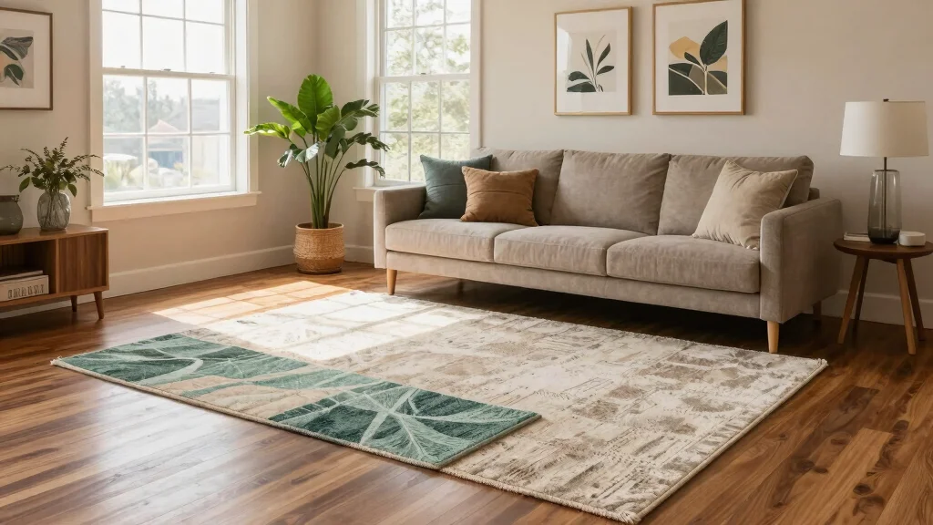
How Texture Saves Neutral Rugs From Flatness
Where does depth hide when color steps back? You’ll find it in texture. Neutral rugs risk flatness when they lack dimensional interest, but pile variation transforms quiet tones into layered experiences.
Choose hand-tufted or sculpted rug textures and you’ll invite shadow play across your floor, each loop and cut pile catching light differently throughout the day. This tactile depth doesn’t merely decorate—it shifts color warmth, making creams read richer and grays more atmospheric.
You avoid the washed-out look by rejecting flat, machine-made surfaces. Instead, you embrace how textured rug construction creates visual architecture. Your neutral palette stays restrained, yet the space feels complete. Texture doesn’t compete with your furniture; it elevates the entire room’s sophistication through subtle, sophisticated dimension.
Recommended Products

【Printed Design Area Rug】Printed rugs are a technological innovation to traditional handmade rugs, designed to look handmade, meanwhile cheaper, more durable, and more colorful, non-shedding. The Geometry Modern Collection is traditional and timeless with a beautiful printed lived-in design that will complement your home décor

Neutral Beige Floral Scalloped Design: This scalloped floral rug features a warm cream beige base, soft beige flowers, muted sage green leaves, and a gentle taupe border. The neutral cottagecore style adds a calm, airy look to bedrooms, living rooms, nurseries, dorms, reading nooks, and cozy home spaces.

Machine Washable & Low Pile: Crafted with a low pile profile, this WondRg rug fits under doors and furniture without obstructing clearance. The machine washable construction allows for effortless maintenance and deep cleaning, making it an ideal choice for high-traffic indoor spaces and pet activity.
Bedroom Calm vs. Living Room Cohesion
Texture gives a rug its quiet power, but the room itself tells you how to wield it. In the bedroom, you’ll select calm colors that whisper rather than announce. Anchor your space with a base neutral—soft ivory, warm sand, or misty gray—then layer one or two accent colors for gentle depth. You’ll notice how warm tones cocoon you while light contrast keeps the air breathable. Avoid visual noise; subtle patterns preserve that essential serene feel against white linens.
Living room cohesion demands something else entirely. There, your rug color bridges sofas, art, and architecture, creating conversation between elements. Where the bedroom retreats, the living room gathers. You’ll choose differently knowing this: sleep requires sanctuary, but gathering spaces require connection.
Recommended Products
LARGE SIZE: This unique 6' x 9' area rug is ideal for larger rooms like bedrooms, living rooms, and kitchens. Other sizes are available to fit any space in your home.

DURABLE AND PLUSH: Crafted from 100% Polypropylene, Long-lasting and sturdy jute backing (rug pad recommended), 0.39 inch rug thickness, meant for indoor use, perfect for high traffic areas, ideal for homes with childrens, fits under most doors

A soft, almost-monochromatic palette of warm light beige and creamy ivory — the diamond pattern emerges through subtle tonal shifts rather than contrast, giving the rug a quiet, enveloping warmth that reads as nearly white in bright light and softly golden in warm lamplight.
Conclusion
You’ve mapped the room’s needs, weighed anchor against airiness, and chosen your thread—neutral ground, one brave accent, texture for depth. Trust that contrast: let the floor breathe beneath furniture, let the bedroom soften, let the living room hold. A rug isn’t merely backdrop; it’s the quiet architecture that ties your vision together. Step back. The harmony you’ve built speaks.
Recommended Products

Super Soft Area Rugs: This navy blue cozy rug is made of faux fur velvet surface and spongy interlayer, which makes dark blue fluffy rug more thick, comfortable, luxurious and skin-friendly. At the same time, plush fibers has a strong toughness and dense, will not fall off, will not fade, no smell. The surface is so dense and soft that it feels like stepping on a cloud
Serene Forest Design: Transform any room with a lush green forest rugs, featuring rich botanical details and calming vintage accents. This 8x10 washable area rug elegant design brings the tranquility of the forest into your living room, bedroom, or kitchen

Super Soft Area Rugs: This deep green cozy rug is made of faux fur velvet surface and spongy interlayer, which makes dark green fluffy rug more thick, comfortable, luxurious and skin-friendly. At the same time, plush fibers has a strong toughness and dense, will not fall off, will not fade, no smell. The surface is so dense and soft that it feels like stepping on a cloud